
A solid photo editing workflow isn't just a checklist—it's your secret weapon for turning raw images into polished, finished work with total consistency. It’s the repeatable system you build for everything from pulling photos off your memory card and organizing them to the final export. Get this right, and you'll save a ton of time while ensuring every single image hits your quality standard.
Building Your Foundational Photo Editing Workflow
Before you even think about tweaking a slider or applying a preset, you need a plan. This isn't about being rigid; it's about creating a smart framework for managing your images from the moment they're shot to final delivery. A disciplined approach is what stands between organized creativity and absolute chaos.
The real goal here is to make your process so second-nature that you can pour all your energy into the creative side of editing. This journey starts with something a lot of photographers gloss over: transferring and organizing your files. Without a solid system, trying to find a specific shot from a few years ago becomes a nightmare.
For anyone in e-commerce, getting this right from the start is non-negotiable. You can find some excellent effective e-commerce photography tips that underscore why this foundational step is so critical for production-ready images.
The First Steps: Ingestion and Organization
The first real action in any workflow is getting images off your card and into your editing software. I can't stress this enough: create a folder structure that makes sense to you and stick with it. A simple Year > Client Name > Shoot Date system can be a lifesaver. This one habit makes finding any project, anytime, a total breeze.
Good photo editing isn't just for pros anymore. The global photo editing software market was valued at around USD 977.66 million in 2024 and is on track to hit over USD 1.5 billion by 2033. That boom shows just how essential a good workflow has become for pretty much everyone creating digital content.
This is the basic flow I'm talking about.
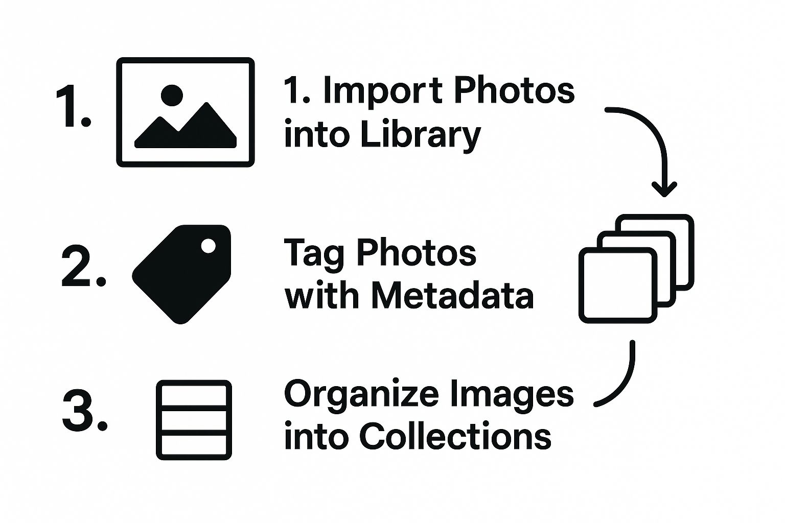
As you can see, a successful process follows a logical sequence. You import the files, add your tags and keywords, and then sort them into their proper place.
Before we dive deeper, it helps to understand the high-level stages. Every effective workflow, whether simple or complex, generally follows this path.
Core Stages of a Modern Photo Editing Workflow
| Stage | Primary Goal | Key Activities |
|---|---|---|
| 1. Ingestion & Organization | To create a secure and searchable photo library. | Transferring files from memory cards, backing up originals, applying metadata (keywords, ratings), and sorting into folders/collections. |
| 2. Culling & Selection | To identify the best images worth editing. | Quickly reviewing all photos from a shoot, rejecting unusable shots, and flagging the "keepers" for editing. |
| 3. Development & Editing | To enhance and stylize selected images. | Making global adjustments (exposure, white balance), local adjustments (dodging, burning), color grading, and applying creative styles. |
| 4. Export & Delivery | To prepare final images for their intended use. | Resizing images for web or print, applying output sharpening, converting to appropriate file formats (JPEG, TIFF), and delivering to the client or platform. |
Having this structure in mind helps you stay on track and ensures no crucial step gets missed, especially when you're working on a tight deadline.
A methodical start is non-negotiable. By importing, adding metadata, and sorting images into collections immediately, you build a searchable and efficient library from day one, preventing future disorganization.
This discipline pays off big time, especially when you're staring down a huge shoot with hundreds or thousands of photos. If you want to really speed things up, check out our guide on how to batch edit photos. It’s packed with techniques for applying edits across multiple images at once—a true game-changer for your efficiency.
The Culling and Organizing Process

If you want to speed up your editing, forget about fancy presets or the latest software for a moment. The real secret weapon is a ruthless and efficient culling process. This is your first line of defense, where you plow through hundreds of photos and make quick, decisive choices that define your entire photo editing workflow.
Let’s be honest, staring at a full memory card can be completely overwhelming. I’ve been there. But by turning the cull into a repeatable system, you can get through it with confidence, making sure you only spend your precious time on the absolute best shots.
A Practical System for Culling Photos
My whole approach is built around a simple pass-through method in Adobe Lightroom, but you can adapt these principles to just about any photo editor. The trick is to avoid getting stuck on any single image during the first pass.
Your only mission here is to weed out the obvious duds. As you scroll, just ask yourself one question: "Is this photo a total technical failure?"
- First Pass (Rejection): Go through every photo quickly. Use the 'X' key in Lightroom to mark a photo for rejection if it's:
- Completely out of focus
- Someone is blinking or making a weird face
- There's unintentional motion blur
- It's an accidental shot of your shoe
- Delete Rejects: Once you've completed the first pass, filter your view to show only the rejected photos (use the filter bar or press Ctrl+Backspace/Cmd+Delete). Select them all and permanently delete them.
This two-step process removes the clutter, leaving you with a more manageable set of images to evaluate.
Identifying the Keepers with Ratings
Now for the fun part. With the junk out of the way, you can do a second pass to find the gems. This is where I start getting more selective, using a star rating system to sort the images that have real potential.
I keep my system dead simple:
- 1 Star: It’s an "okay" photo. Technically it's fine, but it doesn't really have that spark. I keep it around just in case, but it's not a priority.
- 3 Stars: This is a solid contender. The focus is on point, the composition works, and I can already see how it could become a great final edit. These are my definite "keepers."
- 5 Stars: Now we're talking. This is a "banger"—an image that just hits you with great emotion and technical skill. These are the portfolio-makers.
The real skill in culling is learning to trust your gut. Don’t overanalyze every photo. If an image doesn't grab you within a few seconds, it probably won't grab your audience either. Be decisive and move on.
A Bulletproof Folder Structure
A good organization system is the backbone of any sane workflow. When you can find any photo from any shoot in seconds—whether it was yesterday or five years ago—you've won half the battle.
For my client projects, I stick to a clear hierarchy:
Year > Client Name > YYYY-MM-DD_Shoot-Description
For example: 2024 > Nike > 2024-08-15_Fall-Shoe-Collection
For my personal stuff, it's a little looser but just as logical:
Year > Location or Event > YYYY-MM-DD
For example: 2023 > Italy-Trip > 2023-06-22_Cinque-Terre
This kind of discipline is more important than ever. The global photography market was valued at a massive USD 55.6 billion in 2023 and is on track to hit USD 81.83 billion by 2032. As more photos are being created, having an organized, professional workflow is what separates the pros from the amateurs. You can explore more about these photography industry statistics to see just how crucial a solid system is in today's market.
Mastering Your Global Edits
https://www.youtube.com/embed/Gagi5O_zUHE
Now that you've picked out your keepers, it's time to build the foundation of your edit. This is where we handle global adjustments—those broad, image-wide edits that set the entire mood. Think of it like priming a canvas before you start painting. Getting these fundamentals right is a non-negotiable part of a professional photo editing workflow.
My own process always follows a specific order: technical corrections first, then composition, and finally the core exposure and texture tweaks. This approach guarantees every photo starts from a clean, balanced place.
First, Correct and Compose
Before you even think about touching an exposure slider, deal with lens corrections. In Lightroom or Capture One, it's a simple step:
- Go to the Lens Corrections panel.
- Check the box for "Enable Profile Corrections". The software will automatically detect your lens and fix distortion.
- Check the box for "Remove Chromatic Aberration" to eliminate purple or green fringing.
With that done, your next focus is composition. Use the Crop tool (press 'R' in Lightroom) to straighten the horizon and re-frame your shot. Don't be shy here. Play with different aspect ratios and crop in to eliminate any distracting junk on the edges. This step shores up the photo’s structure before you’ve even touched its color or tone.
Reading the Histogram and Nailing Exposure
Okay, now we get to the heart of global edits: exposure. Your absolute best friend here is the histogram. It’s not just a fancy graph; it’s objective data that tells you the exact tonal range of your photo. Stop just eyeballing it and start using the data.
Here’s a step-by-step approach using the Basic panel:
- Step 1 (Exposure): Nudge the slider to set overall brightness. Watch the right side of the histogram—if it's bunched up and "clipping" the edge, you're losing highlight detail.
- Step 2 (Contrast): Gently increase this to add separation between lights and darks. A value of +10 to +20 is often enough.
- Step 3 (Highlights & Shadows): If your highlights are clipped, pull the Highlights slider down to recover detail (e.g., in a bright sky). If your shadows are too dark, lift the Shadows slider up to reveal what’s hiding in dark corners.
A perfectly balanced global edit is the secret to an image that feels authentic, not overcooked. The goal is a clean, full-range image that gives you the perfect canvas for any creative color grading or local adjustments you want to tackle later.
Adding Punch with Texture and Clarity
Once your exposure is balanced, you can start adding some definition. The Texture and Clarity sliders are fantastic for this, but they demand a light touch.
- For Portraits: Use a light touch on Texture (+5 to +15) to enhance skin detail without making it look unnatural. Avoid Clarity, as it can be unflattering.
- For Landscapes: A boost in Clarity (+10 to +25) can add dramatic punch to rocks and clouds. Texture is great for enhancing fine details like foliage or stone.
Getting this right consistently is a real skill. To truly nail your process, it helps to borrow ideas from mastering quality assurance workflows. And if you want to speed through these edits, exploring tools for AI image enhancement can be a game-changer.
Creative Color Grading and Local Adjustments
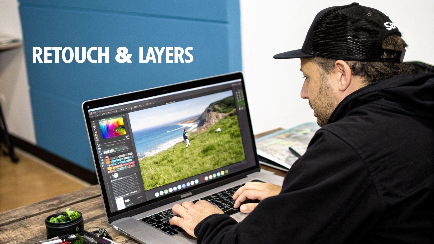
Alright, you’ve nailed the technical basics. Now for the fun part. This is where you move beyond just "correcting" a photo and start creating something truly memorable. Creative adjustments are how you inject your personal style, guide the viewer's eye, and build that signature look that makes your work instantly recognizable. A flexible photo editing workflow always leaves space for this kind of creative play.
We'll kick things off with local adjustments—think of it as digitally painting with light and shadow. From there, we'll dive into color grading, which is all about shaping the mood and atmosphere of the photo through your color choices.
Guiding the Eye with Local Adjustments
Global edits change the whole image at once, but local adjustments give you pinpoint control. This is the secret to making a subject pop. In tools like Adobe Lightroom, the adjustment brush and radial filter are key.
Tutorial: Making a Portrait Subject Pop
- Brighten the Face: Select the Radial Filter. Draw an oval over the person's face. In the filter settings, check the "Invert" box. Now, slightly increase Exposure (+0.25) and Shadows (+15) to gently lift their features.
- Enhance the Eyes: Select the Adjustment Brush. Zoom in on the eyes. With a small brush size, paint over the irises. Increase Exposure slightly (+0.20) and add a touch of Clarity (+10) to make them sparkle.
- Darken the Background: Create another Radial Filter around the subject, but this time, do not invert it. Slightly decrease Exposure (-0.30) to subtly darken the background, pushing the focus onto your subject.
The best local adjustments are the ones you feel, not see. The goal is a gentle nudge, not a shove. You want to guide the viewer’s gaze without them ever realizing you’re doing it. Subtlety is everything.
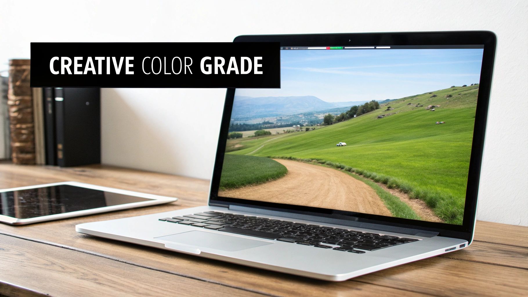
Shaping Mood with Creative Color Grading
With the light perfectly sculpted, it's time to work on the color. This is about evoking a specific emotion. Your command center for this mission is the HSL (Hue, Saturation, Luminance) panel.
Tutorial: Creating a Moody Forest Look
Picture a landscape photo from a hike where the greens are too vibrant.
- Go to the HSL/Color panel and click on Saturation.
- Select the Green slider and pull it down to around -30. This mutes the intense green.
- Select the Yellow slider and pull it down to -20.
- Now, click on Hue. Select the Green slider and shift it slightly towards yellow (e.g., -15) to create a more autumnal, less "digital" green.
This simple tweak can take an image from a basic snapshot to something that feels intentional and artistic.
Split toning is another killer technique. It lets you add a specific color tint to the highlights and a different one to the shadows. For a sunset photo, you could add a warm orange to the highlights to really punch up that golden hour glow, while adding a cool blue or purple to the shadows for a gorgeous color contrast. It's a fantastic way to build a cohesive color palette that ties the whole image together.
Exporting Images for Any Platform
This is it—the final step. After all your hard work culling, correcting, and color grading, the export settings are all that stand between you and a finished image. It's a critical moment, because even a stunning edit can look soft or pixelated if you don't save it correctly for its final destination.
An image destined for a high-resolution print needs a completely different recipe than one you're throwing up on an Instagram story. This is where you lock in all that quality and make sure your vision comes across exactly as you intended.
File Formats And Color Spaces Explained
Your first big decision is picking the right file format and color space. This choice has a huge impact on file size, quality, and how your colors look across different screens and printers.
Step-by-Step Export for Instagram:
- File Format: Set to JPEG.
- Color Space: Set to sRGB. This is non-negotiable for web.
- Quality: Set between 76-85. This offers the best balance of quality and file size.
- Resizing: Check "Resize to Fit" and select "Long Edge." Enter 1350 pixels (for portrait orientation) or 1080 pixels (for landscape).
- Output Sharpening: Check the box and select "Sharpen for: Screen" and "Amount: Standard."
Step-by-Step Export for High-Quality Print:
- File Format: Set to TIFF.
- Color Space: Set to Adobe RGB or use the profile provided by your print lab.
- Compression: Choose None.
- Resolution: Set to 300 pixels per inch.
- Output Sharpening: Check the box and select "Sharpen for: Matte/Glossy Paper" and "Amount: Standard or High."
The biggest mistake I see people make is using a one-size-fits-all export preset. Before you hit "Save," always ask yourself: "Where is this image going to live?" The answer dictates your settings.
Sharpening For Print Vs. Screen
Sharpening isn't a simple on-or-off switch. The right amount of sharpening depends entirely on whether the photo will be viewed on a screen or on paper. Get this wrong, and your images can look "crunchy" and overprocessed.
- Sharpening for Screen: Digital displays are incredibly crisp and don't need much help. The "Standard" amount for screen sharpening is usually perfect.
- Sharpening for Print: Photos on paper absorb light, which can make them look a bit softer. They need more aggressive sharpening. A "High" amount for the correct paper type is often necessary.
The demand for easier editing tools has skyrocketed. The photo editing software market in North America alone jumped from USD 266.48 million in 2021 to an estimated USD 377.44 million in 2024, largely because everyone wants great-looking photos for social media.
And speaking of photos, if you're dealing with old family pictures, you might want to check out our guide on https://aiphotohq.com/blog/2025/07/photo-restoration-online to bring those memories back to life. For your newer shots, especially for social media, it's worth reading up on some tips for creating amazing Instagram photos.
My final piece of advice? Create export presets in your software for each of these outputs. It will save you countless hours and guarantee you get consistent, professional results every single time.
Alright, let's tackle a couple of the most common questions that pop up when you're trying to lock in a solid photo editing workflow. Even the best plans hit a snag or two, so let's clear these hurdles.
How Long Should I Really Spend Editing Each Photo?
Honestly, there's no single magic number. It all comes down to the photo itself.
For a clean, well-exposed shot straight out of the camera, you might only need 2-5 minutes for some minor tweaks. But if you're working on a complex landscape with multiple layers or doing detailed portrait retouching, it's not unheard of to spend 30 minutes to an hour on a single image.
The real goal isn't just about being fast; it's about being efficient. If you feel like your edits are dragging on, try timing yourself on a small batch of photos. You'll quickly see where the slowdowns are. Is it getting the colors right? Maybe creating a few custom presets is the answer.
Think of presets as your starting point, not the finish line. The best trick I've learned is to apply a preset that gets you about 70% of the way there. From that point, you just need to make small, specific adjustments to the exposure, white balance, or contrast to make it perfect for that photo. It's the perfect blend of speed and custom control.
Destructive vs. Non-Destructive Editing: What’s the Big Deal?
This one is absolutely crucial for any photographer who's serious about their craft. Understanding the difference will save you countless headaches.
- Non-destructive editing: This is how programs like Adobe Lightroom work. Instead of changing your original photo, the software just keeps a list of your edits. You can always go back, undo a change, or try something new—even years later. Your original file remains completely untouched.
- Destructive editing: This method permanently changes the actual pixels in your image. Once you save, that's it. The changes are baked in, and you can't go back.
For any serious workflow, you should always work with non-destructive tools. It’s non-negotiable. This approach protects your original images, gives you the freedom to experiment without risk, and is the only way to maintain the highest possible quality.
Ready to stop wrestling with complicated software and start creating stunning visuals in seconds? AI Photo HQ gives you the power to generate professional-quality photos and restore old memories with intuitive AI tools. Transform your creative workflow today at https://aiphotohq.com.


