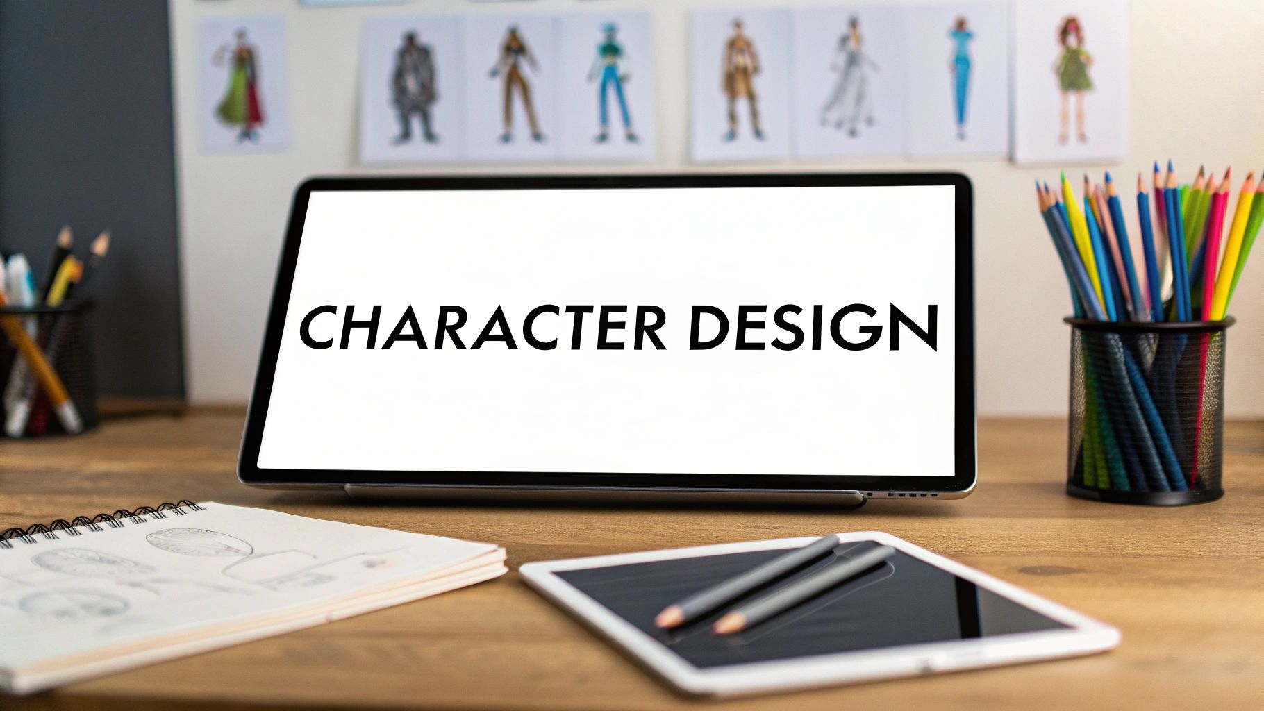
The fundamentals of character design are a set of core ideas artists lean on to create characters that stick with you. Think of concepts like silhouette, shape language, anatomy, color, and storytelling. Mastering these isn't about memorizing rigid rules. It’s about learning a visual language so you can effectively communicate a character's personality and purpose through practical, step-by-step application.
Why Strong Fundamentals Matter in Character Design
Before you even think about putting pencil to paper (or stylus to tablet), you need to get a handle on the core principles. The most iconic characters from games, comics, and animation are so much more than just pretty drawings. They are storytelling machines, meticulously built from the ground up. Every single choice, from their basic outline to the colors they wear, is made for a reason.
Think of it like learning to speak a new language. If you don't know the grammar and vocabulary, your message—your character's entire vibe and story—is going to get lost in translation. This guide is your roadmap to mastering that visual language, showing how each principle stacks on top of the others to create characters that feel genuinely alive.
The Five Pillars of Character Creation
To really nail character design, you have to start thinking like a designer. That means focusing on the big picture before you get lost in the tiny details. It’s about constantly asking why you're making a certain design choice, not just what you're drawing. The whole journey starts with a solid foundation built on five key pillars.
To give you a quick overview, here are the fundamental concepts we'll be diving into.
The Core Principles of Character Design
| Principle | Primary Function | Key Question It Answers |
|---|---|---|
| Silhouette | Instant Readability | Can you recognize the character from their outline alone? |
| Shape Language | Subconscious Communication | What feeling does the character's form evoke? (e.g., safe, dangerous) |
| Anatomy | Believability & Posing | Does the character's structure make sense for their actions? |
| Color Theory | Emotional Resonance | What mood or personality do the colors convey? |
| Storytelling | Narrative Cohesion | Does every design choice reinforce who this character is? |
These elements are the building blocks for creating a character that resonates with an audience. Let's break them down a bit further.
A Deeper Look at the Pillars
- Silhouette: This is your character's outline, plain and simple. A strong, clear silhouette means the character is instantly recognizable, even if you can only see their shadow. Think of iconic figures like Mickey Mouse or Darth Vader.
- Shape Language: Shapes send subconscious messages. Circles often feel soft and friendly. Squares feel sturdy and reliable. Triangles? They can feel dynamic, aggressive, or even dangerous. You're using these basic forms to give immediate clues about your character's nature.
- Anatomy and Proportions: This is what governs how your character is physically built. Even if your style is highly exaggerated, having a believable internal structure makes their poses and expressions feel authentic and grounded.
- Color Theory: Color is a massive shortcut to emotion. A character's color palette can instantly signal their mood, define their personality, and even hint at their role within the larger story.
- Storytelling: This is the ultimate goal, the thing that ties everything else together. Every design choice you make should serve the character's narrative, revealing who they are, where they've come from, and what they're all about.
These principles don't exist in a vacuum; they all work together. A powerful silhouette is usually created with clear shape language, and your color choices should always enhance the story you're trying to tell. If you're just getting started in this world, checking out some foundational concepts can be a huge help. Our guide on digital art for beginners is a great place to get familiar with the basic tools and techniques you'll need.
Key Insight: Truly great character design is all about clarity and intention. A memorable character communicates their core identity in a single glance, long before an audience learns their name or backstory. These fundamentals are your toolkit for creating that immediate connection.
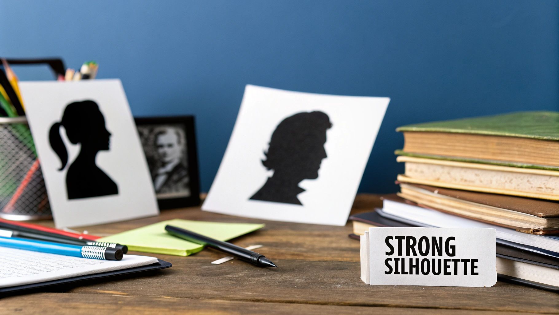
2. Master Silhouettes to Create Iconic Characters
How can you instantly recognize Mickey Mouse or Darth Vader from just their shadow? The secret isn't in their color or costume details—it's their silhouette.
A silhouette is the character's solid black shape, completely stripped of any internal lines, colors, or textures. It's the very first thing your audience processes, and it's the ultimate test of whether your design is clear, memorable, and impactful. Before you even think about the eyes, the clothes, or the color palette, you have to nail this foundational shape.
A powerful silhouette telegraphs personality, function, and story in a single glance. If that outline is messy, generic, or confusing, no amount of fancy rendering will ever be able to save it.
Why Silhouettes Always Come First
When you focus on the silhouette, you’re forced to make big, bold decisions about your character’s fundamental form right away. It’s all about answering the most important questions first:
- Is it recognizable? A unique outline makes sure your character doesn’t just blend into the background.
- Is its role clear? A flowing cape, massive horns, or spiky armor can immediately signal a character's purpose.
- Does the pose have energy? The silhouette is pure body language—it captures the character's mood and intent through their posture alone.
Think of it like building a house. The silhouette is the foundation and the frame. If that structure is wobbly, the entire house is compromised, no matter how nice the paint job is.
Key Insight: A great silhouette is visual shorthand. It packs the most information into the least amount of detail, making your design instantly readable and unforgettable.
A Practical Guide to Creating Distinct Silhouettes
Alright, let's move from theory to practice. This is a hands-on exercise designed to show you just how much a character's identity can shift by only changing their outline. We'll start with a single, boring shape and transform it into three classic archetypes: a hero, a villain, and a sidekick.
Step 1: Start With a Basic Shape
Grab your pen or stylus and just draw a simple shape. A plain oval or a soft rectangle is perfect. This is our lump of clay—a totally neutral form with zero personality. Your job is to push, pull, and sculpt it into something that feels alive.
Step 2: Design the Hero
For our hero, we need to communicate strength, confidence, and stability.
- Create a Strong Stance: First, widen the base of the shape to give them a grounded, solid feel. Think of a classic "A-frame" pose, with feet planted firmly on the ground.
- Build a Clear Vertical Form: Emphasize the upper body. Broaden the shoulders and pull the posture upright. This immediately reads as bravery and a readiness to act.
- Add Iconic Elements: Now, add simple but recognizable features to the outline. A flowing cape, the distinct curve of a helmet, or the edge of a shield. The key is to keep these additions clean—avoid small, fiddly details that will disappear in shadow. What you want is a noble, heroic outline.
Step 3: Design the Villain
Next, let's take that same starting shape and twist it into a villain. Villains are all about threat, instability, and aggression.
- Use Sharp, Angular Shapes: Ditch the stable squares and go for sharp triangles and jagged edges. Think pointed shoulders, long claws, or spiky armor. These shapes are a universal sign for danger.
- Create an Unbalanced Pose: Make the character lean forward aggressively or hunch over like a predator. An off-kilter posture feels unpredictable and deeply unsettling.
- Play with Negative Space: Use the empty space around your character to your advantage. A horned helmet creates two sharp points against the sky, while a tattered, spiky cloak can produce a truly menacing and unique outline.
Step 4: Design the Sidekick
Finally, let's create a sidekick. This archetype can vary a lot, but they often need to feel approachable, maybe a bit quirky or even clumsy.
- Embrace Asymmetry: Unlike the perfectly balanced hero, a sidekick can be lopsided. One shoulder might be higher than the other, or they might have a single large bag slung over their back. This asymmetry suggests a more unique, off-beat personality.
- Soften the Form: Use rounder, softer shapes. A circular body with skinny, gangly limbs often communicates friendliness, youth, or even a bit of awkwardness. It's a much less intimidating form.
- Vary the Scale: Make the sidekick noticeably smaller or thinner than the hero. This visual contrast instantly tells the audience about their relationship and pecking order.
When you're done, you should have three wildly different silhouettes that each tell a clear story, all from the same boring starting point. This exercise proves that a character's true identity is forged in their outline long before you ever add a single detail.
Using Shape Language to Communicate Personality
Once you've nailed down a strong silhouette, the next layer to master is shape language. This is one of the most powerful character design fundamentals, and it's all about using basic geometric shapes to send instant, subconscious messages about who your character is.
Think of it this way: every line you draw, from a soft curve to a sharp angle, tells a piece of the story before the audience even sees a facial expression. Our brains are already wired to associate certain shapes with specific feelings. Circles feel safe. Squares feel stable. Triangles feel dangerous. By deliberately building your character from these core components, you’re embedding their personality right into their DNA.
The Psychological Power of Core Shapes
This isn't just some artsy trick; it’s grounded in basic human psychology. We instinctively link shapes to real-world objects and the feelings they give us. A ball is harmless, a brick wall is immovable, and a shard of glass is a threat. Tapping into this shared understanding is how you create designs that click with people immediately.
Circles and Ovals: These shapes have no sharp edges. They're soft, gentle, and scream friendliness, innocence, and approachability. This is the language of cuddly sidekicks, kind-hearted parental figures, and bubbly heroes who wouldn't hurt a fly.
Squares and Rectangles: With their hard lines and right angles, squares and rectangles feel solid, dependable, and strong. They can also read as stubborn, rigid, or boring. This makes them perfect for stoic heroes, unshakeable royal guards, or even unimaginative, bureaucratic villains.
Triangles and Sharp Angles: Anything with a point can poke you. Our brains know this. That's why pointed shapes signal aggression, danger, and unpredictability. While they are the go-to for classic villains, triangles can also be used to show that a character is dynamic, witty, or full of chaotic energy.
Key Insight: Shape language is your character's unspoken introduction. A character made of circles invites a hug, one built from squares commands respect, and one made of triangles puts everyone on high alert.
Tutorial: Building Characters with Shape Language
Alright, let's stop talking and start doing. We'll walk through a quick tutorial to design two classic archetypes—an approachable hero and a menacing villain—using nothing but their core shape language as our guide.
Step 1: Design an Approachable Hero with Circles
Our goal here is to create a character who instantly feels trustworthy and kind. To do that, we'll lean almost entirely on circles, ovals, and soft, flowing curves.
- Start with a Circular Torso: A big, soft circle for the main body immediately sets a non-threatening and friendly tone. It's the base of our character's welcoming vibe.
- Add a Round Head and Soft Limbs: Pop a smaller circle on top for the head. For the arms and legs, think soft, noodle-like ovals. Avoid any sharp angles at the elbows or knees to give them an almost plush-toy-like quality.
- Incorporate Round Details: Finish it off with large, circular eyes, a simple curved smile, and soft, rounded ears or hair. Every single detail should echo the core circular shape, making the character feel overwhelmingly safe and good-natured.
The final result should look like something you want to hug. Its entire structure, from its body to its face, is built on the psychology of the circle, making it instantly readable as a "good guy."
Step 2: Design a Menacing Villain with Triangles
Now for the fun part—the hero's opposite. This character needs to radiate danger and aggression from the very first glance. We'll use a symphony of triangles and sharp, angular lines to make that happen.
- Start with an Inverted Triangle Torso: Draw a large, upside-down triangle for the body. This creates a top-heavy, powerful silhouette with broad shoulders and a narrow waist, which feels inherently dominant.
- Add Angular Limbs and a Sharp Head: Use jagged, triangular shapes for the arms and legs, really emphasizing pointed elbows and knees. The head shouldn't be a soft circle; give it an angular or pointed shape instead.
- Incorporate Sharp Details: Give the villain narrow, slanted eyes, a jagged grin, and spiky hair or horns. Even their clothing, like a cloak or armor, should have sharp, triangular cutouts to hammer home the sense of danger.
This design feels sharp and unsettling. Its angular construction screams "threat," telling the audience everything they need to know about this character's malevolent intentions.
Combining Shapes for Complex Personalities
Of course, most characters aren't 100% good or 100% evil. The best ones are complex, and you can show that by mixing and matching your shapes. This is where you can get really creative.
- The Bumbling Brute: You could start with a huge, square body to communicate strength, but then give them soft, circular hands and feet. This combination hints at a gentle or clumsy nature hiding beneath a tough exterior.
- The Cunning Hero: A hero might have a generally rounded and friendly design, but maybe you give them sharp, triangular eyes or a pointed chin. This small detail can suggest a hidden intelligence or a razor-sharp wit.
Learning to thoughtfully combine these foundational elements is what separates good character design from great character design. By mastering shape language, you can tell a surprisingly complex story using the simplest of forms.
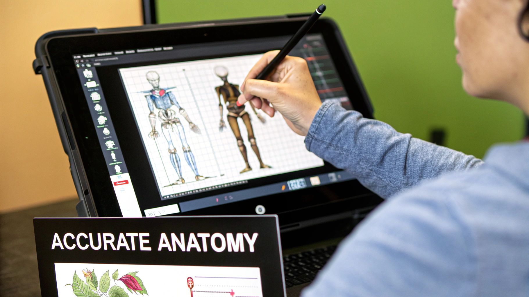
Building Believable Anatomy and Proportions
If silhouette and shape language are the foundation, then believable anatomy is what gives your character a soul. This isn't about cracking open a medical textbook and memorizing every muscle. Not at all. It's about getting a feel for the underlying logic of how a body moves, how it holds its weight, and how it expresses itself through something as simple as its posture.
Even the most outlandishly stylized cartoon character has some kind of anatomical logic holding it together. It's this hidden structure that makes their poses feel dynamic and alive, saving them from looking like a stiff, lifeless doll. Getting a grip on the basics of anatomy is a non-negotiable step in your journey.
From Skeleton to Story
The best way to dive in is to simplify. Forget about intricate muscle groups for now. Instead, start with a basic mannequin or even just a stick-figure skeleton. This approach strips everything back so you can focus on two crucial things: proportion and gesture.
Think of this simplified skeleton as the scaffolding you build your character on. It's your quick-check tool for making sure the pose is balanced, the limbs are the right length relative to the body, and the whole thing has a clear line of action and energy.
Key Insight: Anatomy is basically the grammar of body language. It gives you the rules you need to tell a story with a character's posture, communicating their mood, status, and what they're about to do—all without them saying a word.
Think about it. A character hunched over with rounded shoulders immediately feels sad or defeated. One with their chest puffed out and back straight? Confident, maybe even a little arrogant. That’s anatomy working as a storytelling powerhouse.
Exaggerating Proportions for Personality
Once you have a handle on the basic rules of proportion, the real fun begins. Now you can start intentionally breaking those rules to create a specific effect. This isn't just random distortion; it’s a calculated choice to crank up a character’s personality.
Let's walk through creating a classic "brute" character to see how this works:
- Enlarge the Torso and Shoulders: Kick things off by drawing a massive, square, or trapezoid-shaped torso. Right away, this creates a feeling of immense power.
- Shrink the Head: Make the head proportionally smaller. This is a classic visual trick that downplays intelligence and makes the character's physical size feel even more imposing.
- Thicken the Limbs: Draw thick, heavy arms and legs. You might even give them oversized hands and feet to really sell the idea of raw, clumsy strength.
- Shorten the Neck: A short, thick neck just doubles down on that powerful, tank-like look.
By deliberately warping realistic proportions, you've created a character who screams "powerhouse" at a glance. You've used anatomy not for realism, but to communicate a core personality trait—brute force.
Actionable Exercises for Expressive Characters
Anatomy isn’t just for static poses. It’s about bringing movement and expression to life. Here are a couple of practical exercises to stop your characters from feeling so rigid.
Bring Hands to Life
Hands are notoriously tricky to draw, but they are incredibly expressive storytellers. The secret is to stop thinking about them as complicated and instead break them down into simple, blocky shapes first.
- Palm: Start with a simple square or a slightly trapezoidal block.
- Fingers: Attach four simple cylinders or rectangular blocks for the fingers.
- Thumb: Add a triangular wedge on the side for the thumb's base, then attach two smaller cylinders to it.
Once you have this basic construction down, you can pose it in endless ways. A clenched fist shows anger, a relaxed open palm suggests friendliness, and a pointed finger gives a command.
Capture Dynamic Poses with Gesture Drawing
Gesture drawing is all about capturing the energy and flow of a pose in seconds. Forget detail. Your only goal is to find the "line of action"—a single, fluid curve that sweeps through the character's body from head to toe.
Try this: set a timer for 30 seconds and capture a pose using as few lines as you can. This exercise trains your brain to see the rhythm of the body, which leads to far more dynamic and less "posed" looking characters. It’s one of the best drills out there for truly understanding how anatomy creates motion.
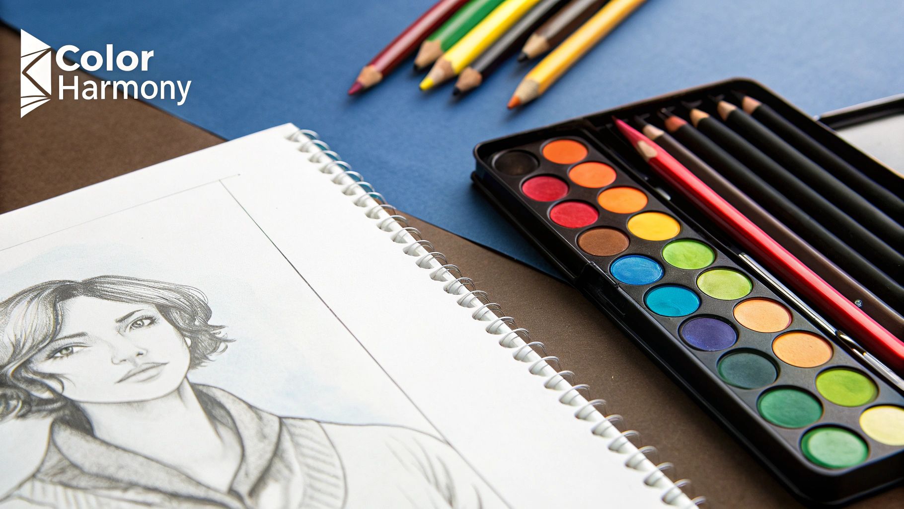
4. Applying Color Theory To Enhance Your Story
Color isn't just window dressing. Think of it as a direct line into your audience's brain—a powerful storytelling tool that can scream volumes about a character's personality, status, and narrative role before they even move a muscle. This is a massive part of mastering character design fundamentals.
We're going way beyond the simple "red means anger" clichés. The real magic happens when you build sophisticated, thoughtful color palettes that give your characters genuine depth and make them feel like a believable part of their world. Every color choice should be deliberate, backing up all the other design decisions you’ve made.
The Power of Value and Saturation
Before you even start picking out blues or greens, you need to get a handle on value and saturation. Honestly, these two elements are often more critical than the specific hue for creating a design that just works.
- Value Creates Readability: Value is simply how light or dark a color is. A character with strong value contrast—clear, distinct differences between light and dark areas—will be instantly readable, even if you drain all the color out. It's how you lead the viewer's eye right where you want it, like to the face or hands.
- Saturation Sets the Mood: Saturation is a color's intensity. Bright, highly saturated colors feel energetic, young, maybe even a bit chaotic. On the flip side, muted, desaturated tones come across as more serious, grim, or sophisticated. Think of saturation as the emotional volume knob for your character.
These ideas aren't just for illustrators; they're fundamental to all visual arts. Photographers, for instance, use light and shadow in much the same way to create focus and mood. You can actually learn a lot by checking out our guide on composition rules for photography and seeing how those principles overlap with character design.
Key Insight: Here’s a great test: convert your design to grayscale. If it becomes a muddy, confusing mess, your values aren't doing their job. A strong design should hold up and remain compelling even without any color at all.
Practical Tutorial: Creating Three Palettes for One Character
Let's put this into practice. We'll take a simple, neutral character sketch and see how drastically we can shift their perceived personality just by swapping out the colors.
1. The Heroic Palette (Analogous with a Complementary Accent)
For a classic hero, we need colors that feel trustworthy, strong, and noble. An analogous scheme (using colors that sit next to each other on the color wheel) builds a nice harmony, and a pop of a complementary color adds that necessary spark of excitement.
- Dominant Color: A strong, dependable blue for the main outfit. Blue is a classic for a reason; it often signals loyalty and stability.
- Secondary Color: A lighter, desaturated cyan or teal for secondary bits of clothing. It supports the blue without fighting it for attention.
- Accent Color: A vibrant, warm yellow or gold for emblems or trim. As blue's complement, it creates a powerful focal point that says, "Hey, look here! This is important."
2. The Sinister Palette (Triadic and Desaturated)
For a villain, you want a palette that feels dangerous and maybe a little unsettling. A triadic scheme (using three colors evenly spaced on the wheel) is great for creating visual tension, especially when you play with the saturation.
- Dominant Color: A deep, desaturated crimson or maroon. This isn't the red of simple rage; it's a darker, brooding menace.
- Secondary Color: A sickly, muted green for little accents on armor or maybe a magical glow. This creates a jarring, almost toxic contrast with the red.
- Accent Color: Black or a very dark gray. Using black heavily can make a character feel imposing and powerful, as if they're absorbing all the light around them.
3. The Neutral or World-Weary Palette (Monochromatic)
What about a neutral bystander, a grizzled survivor, or a pragmatic rogue? A muted, practical palette immediately communicates their lack of flash or allegiance. A monochromatic scheme, built from variations of a single hue, is perfect for this.
- Dominant Color: A mid-tone brown or gray. These earthy, neutral colors feel grounded and don't scream for attention.
- Secondary Color: Lighter and darker shades of that same brown/gray. This creates a cohesive look that is visually quiet.
- Accent Color: A single, slightly more saturated spot of color—like a faded olive green strap or a spot of rusty orange on a piece of gear—can hint at a backstory without being too loud about it.
Color and Cultural Context
It’s absolutely critical to look beyond your own personal tastes when picking colors. A professional character designer knows that the process starts with research. For a character meant for a global audience, you have to consider how colors are perceived across different cultures. A color that’s heroic in one culture might have completely negative associations in another.
And beyond the creative choices, there's the technical side. Ensuring your colors look the same across different screens and in print is a discipline all its own. For anyone serious about their work, digging into the details of mastering color management in printing is essential for making sure your character designs are reproduced exactly as you intended.
Tutorial: A Full Character Design Workflow
Alright, let's put all this theory into practice. Knowing the rules is one thing, but actually sitting down and creating a character is where the magic really happens. This is how you can pull everything we've talked about—silhouette, shape language, anatomy, and color—into a single, creative workflow.
Let's work with a prompt: A shy, robotic librarian from the future.
This little phrase is gold. It gives us a personality (shy), a physical type (robotic), and a role (librarian from the future). Every single design choice we make from here on out will be guided by these three pillars. Think of this less as a rigid checklist and more as a way to see how each principle builds on the last.
This visual guide breaks down the creative journey, taking you from that first spark of an idea to a fully realized design.
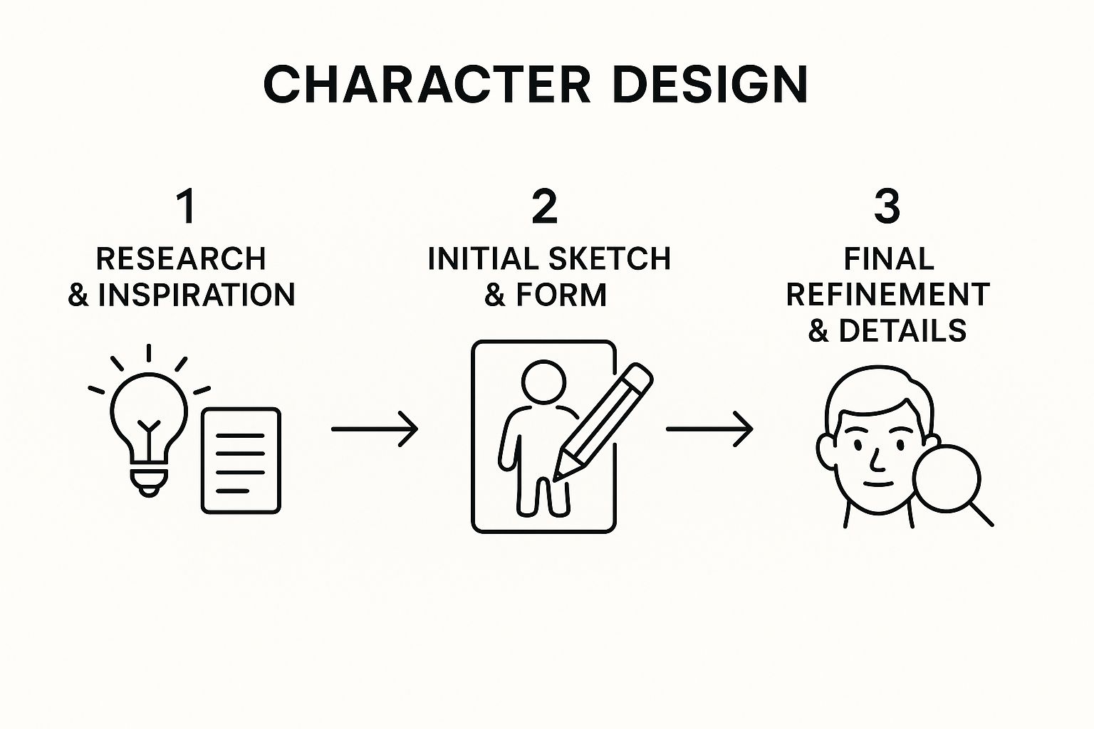
You can see how a character starts as pure research and brainstorming before becoming a tangible sketch and, finally, a polished and detailed concept.
Step-by-Step Design Process
First things first, let's gather some reference material. What does "shy" look like visually? Think hunched postures, maybe arms pulled in close to the body. For "robotic librarian," we can pull inspiration from all over—vintage library card catalogs, clunky old computer terminals, or even the sleek lines of modern robotics. The real originality comes from mashing these different ideas together.
Now, let's apply the core principles we've covered.
Exploring Silhouettes: Start by sketching out dozens of super-fast, blacked-out shapes. To capture that "shy" feeling, try silhouettes that are curled inward or have a big, heavy shell protecting a smaller frame inside. The goal is to find an outline that’s instantly readable as "shy" and also completely unique.
Building with Shape Language: Once you land on a strong silhouette, it's time to refine the internal shapes. For this character, lean heavily on soft, rounded shapes—circles and ovals—to play up a gentle, non-threatening vibe. But to get that "librarian" feel, you can sneak in some subtle rectangular shapes, almost like the drawers of a card catalog or the spine of a book.
Defining Anatomy and Pose: Since our character is a robot, we can have a lot of fun with the anatomy. Give it a slightly hunched-over posture, with its arms held close to its torso. This pose immediately reinforces the shy personality. Maybe its "head" is just a simple screen that displays timid little emoticons.
In many industries, especially gaming, this is where you'd also define a character archetype. For video game character design, archetypes and rich backstories are absolutely critical for getting players invested. It’s an increasingly data-driven process where designers match character traits to gameplay mechanics to create an immersive experience.
Applying a Narrative-Driven Color Palette: To nail the shy librarian theme, a muted, almost monochromatic color palette feels right. Think soft greys and faded cream colors, like the pages of an old book. We can then add a single, tiny pop of a warm, glowing color—a soft blue or orange light from its "eyes" or a status indicator—to serve as a focal point and inject a bit of personality.
Adding Final Details: This is the last layer, where we add the small touches that tell a story. Maybe the robot has a built-in book scanner on one arm, or tiny, extendable limbs for plucking books off high shelves. A few scuffs and scratches on its metal body could suggest a long, quiet life of dedicated service. These are the details that make a character feel real and lived-in.
Common Questions About Character Design
As you get your hands dirty with character design, you’ll find some questions come up again and again. Let's walk through a few of the most common roadblocks artists face and give you some practical answers to push past them.
What Is the Most Important Fundamental for a Beginner?
If you're just starting out, the single most critical skill to nail down first is the silhouette. Think of it as the bedrock of a memorable character.
A strong, unique silhouette makes your creation instantly recognizable, even from a distance or as a tiny icon. It screams their core identity at a glance. Before you even think about colors, textures, or intricate details, just play around with solid black shapes. This exercise forces you to focus purely on the overall form and pose, which is where the magic really begins.
How Do I Create an Original Character?
True originality rarely comes from a lightning bolt of inspiration. It’s usually born from mixing unexpected ideas and pulling from sources that aren't obvious. Step away from just looking at other artists' characters for a bit.
Instead, dive into real-world history, unique cultures, strange patterns in nature, or even the design of old, forgotten machinery.
For example, instead of another standard knight, what if their armor was inspired by the shimmering, iridescent shell of a specific beetle? Or what if you mashed up a personality trait like 'anxious' with a bizarre job like 'interstellar baker'? The secret is to blend your influences into something new, not just copy them.
Do I Need to Be an Anatomy Expert?
Absolutely not. You don't need a medical degree, but a solid, practical understanding of anatomy is a game-changer. The goal isn’t photorealistic perfection; it’s believability. You just need to know enough to make your characters feel like they could actually exist.
Focus on the fundamentals: proportion, balance, and the flow of a pose (gesture). Use simplified skeletons or artist's mannequins to block out your figures. Understanding how a body shifts its weight or how posture can broadcast an emotion is far more powerful than knowing the name of every single muscle. This knowledge is a cornerstone of great visual storytelling, a topic we explore more deeply in our guide on visual storytelling techniques.
Ready to stop sketching and start seeing your characters come to life? With AI Photo HQ, you can generate stunning, high-quality images of your creations in just seconds. From lifelike portraits to epic fantasy and anime art, our powerful AI tools make it easy to visualize your concepts and explore endless variations. See what your imagination can do at https://aiphotohq.com.


