So, what exactly is photo colour grading? Think of it as the final, artistic touch that gives your photos a specific mood or style. It's where you go beyond just making things look "correct" and start intentionally shifting colours to tell a story and create a distinct aesthetic.
It’s the secret sauce that makes your photography truly yours.
The Art of Emotional Storytelling Through Colour

I like to think of colour grading as the musical score for an image. A film composer uses specific notes and instruments to make you feel tension, joy, or a sense of longing. In the same way, a photographer uses colour to pull a specific emotional response from the viewer.
It's the step that elevates a technically solid photo into a powerful, evocative piece of art.
But this creative stage is completely different from its technical cousin, colour correction. Colour correction is all about the science—fixing problems to make an image look natural and accurate, just as your eye saw it. This means tweaking the white balance, exposure, and contrast to get a clean slate.
Colour grading is what you do after all that is sorted. It's where your artistic vision takes over.
Correction vs. Grading: The Key Differences
To really get the distinction, it helps to see them side-by-side. Correction is the setup; grading is the performance.
Here’s a quick table to break it down.
Colour Correction vs Colour Grading at a Glance
| Aspect | Colour Correction | Colour Grading |
|---|---|---|
| Goal | Accuracy and neutrality. Make it look "real." | Mood and style. Make it feel something. |
| Process | Technical adjustments (white balance, exposure, contrast). | Creative manipulation (shifting hues, saturation, tones). |
| Nature | Objective. There’s a “right” and “wrong.” | Subjective. It’s all about artistic intent. |
| When to Use | The very first step in any editing workflow. | The final step, after all corrections are made. |
Ultimately, colour correction is about fixing the photo, while colour grading is about finishing it.
Colour grading isn't just about making photos look "better"; it's about making them feel a certain way. It directs the viewer's eye, establishes a consistent look, and gives your work a signature style that sets it apart.
Why Colour Grading Is So Important Today
In a world where we’re flooded with images every single day, a unique colour palette is what makes your work stop the scroll. This is a game-changer in commercial fields, especially in areas like product photography, where the right mood can directly influence a buyer's decision.
Brands are catching on, big time. By 2025, more and more companies are expected to use deliberate colour grading to express their core values and trigger specific emotions in seconds—a critical skill on fast-paced social platforms.
It’s no longer just a cool aesthetic choice; it’s a powerful strategic tool for communication.
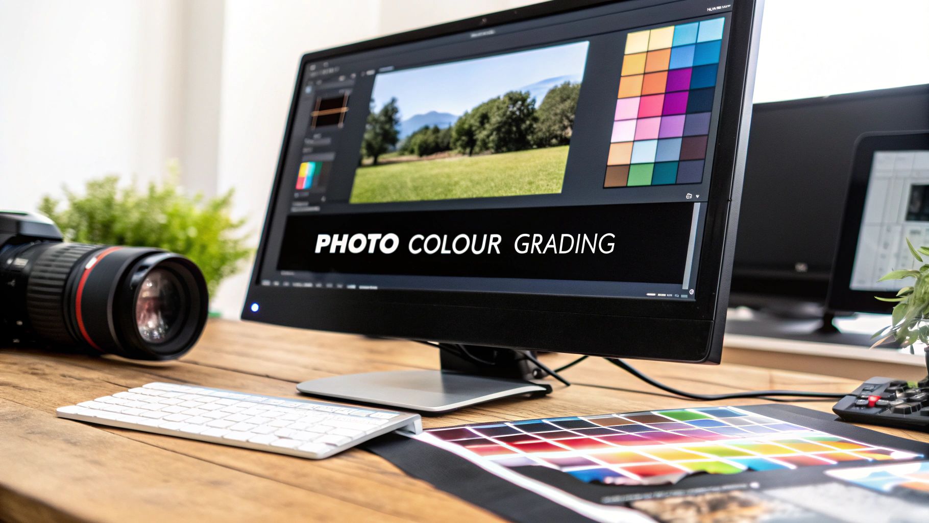
The Essential Toolkit for Professional Colour Grading
To really bring a specific mood to life in a photo, you need the right set of digital brushes and canvases. Professional colour grading comes down to a handful of powerful software options and, more importantly, a solid feel for their core features. Think of this as your creative control room, where every dial and slider helps shape the final story your image tells.
The industry really rallies around a couple of key programs, mainly Adobe Lightroom and Capture One. While both are fantastic, they have slightly different vibes. Lightroom is often loved for its super intuitive layout and how easily it plays with Photoshop, making it a go-to for tons of photographers. Capture One, on the other hand, gets praise for its incredibly powerful RAW processing and next-level colour control, especially when you're working with skin tones.
But honestly, no matter which one you pick, the real power is hiding in just a few specific panels. Getting comfortable with these is the key to unlocking what's in your head and putting it onto the screen.
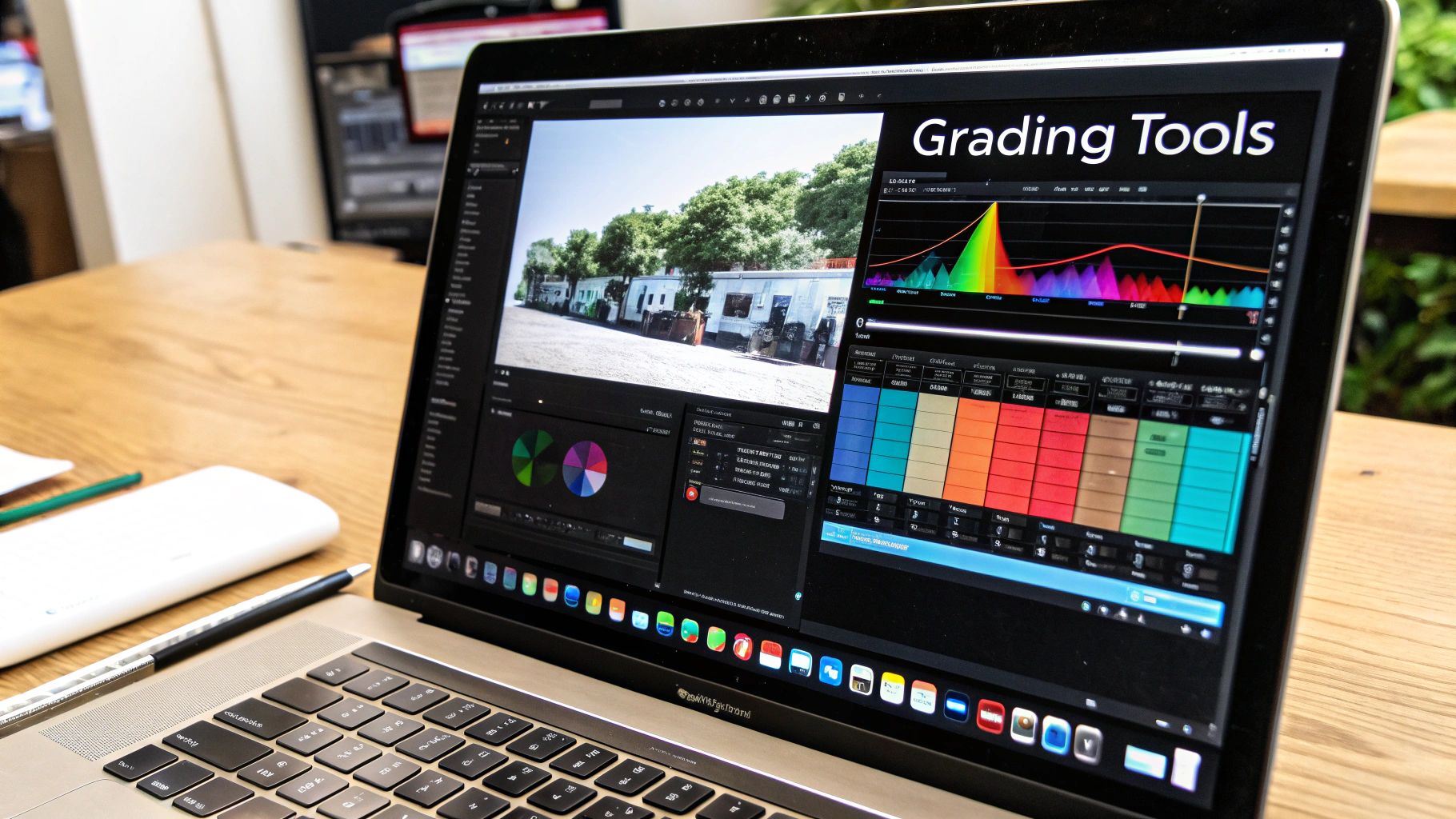
Understanding Your Core Colour Grading Tools
Your software's colour panels are where all the magic happens. Don't be intimidated by them; just think of each one as a specialised instrument for shaping the mood and feel of your shot. There are three you absolutely have to master:
The Tone Curve: This is your master control for contrast and atmosphere. By grabbing and pulling the curve, you can brighten or darken specific tonal ranges.
- How to use it: Create a gentle "S-curve" by clicking in the middle of the line, dragging the lower part down slightly to deepen shadows, and pulling the upper part up slightly to brighten highlights. This instantly adds pleasing contrast and depth.
HSL (Hue, Saturation, Luminance) Panel: Think of HSL as your colour command centre. It lets you grab one specific colour and tweak it without messing up the rest of the photo.
- How to use it: Want to make a blue sky richer? Select the 'Hue' tab, grab the blue slider, and shift it towards cyan. Then, under the 'Saturation' tab, boost the blue slider. For brighter skin tones, find the 'Luminance' tab and gently raise the orange slider.
Colour Wheels (or Split Toning): Often found in a "Colour Grading" panel, these wheels give you cinematic control over your tones. You can push specific colours into the shadows, midtones, and highlights separately.
- How to use it: A common technique is to click the center of the 'Shadows' wheel and drag it towards a teal or blue hue. Then, select the 'Highlights' wheel and drag it towards a warm orange or yellow. Adjust the 'Saturation' slider below each wheel to control the intensity.
Your monitor is your window to the world of colour, but if that window is tinted, everything you create will be skewed. Monitor calibration isn't an optional step for serious photographers; it's a fundamental requirement for accurate and consistent work.
The Non-Negotiable Step: Monitor Calibration
Before you even think about touching a single slider, you have to be sure you can trust what you're seeing. An uncalibrated monitor could be showing you colours that are too warm, too cool, or way too saturated. You might spend hours getting a grade just right, only to discover it looks completely different on someone else's screen or when you print it.
Calibration devices create a custom profile for your monitor to make sure colours are displayed accurately. It's the only way to guarantee that the subtle changes you're making are actually happening in the photo, not just on your screen. It’s the foundational step that ensures your creative vision translates reliably to the outside world.
As technology keeps pushing forward, so do the ways we can perfect our images. You can learn more about how artificial intelligence is improving photo enhancement and see how it's fitting into modern workflows.
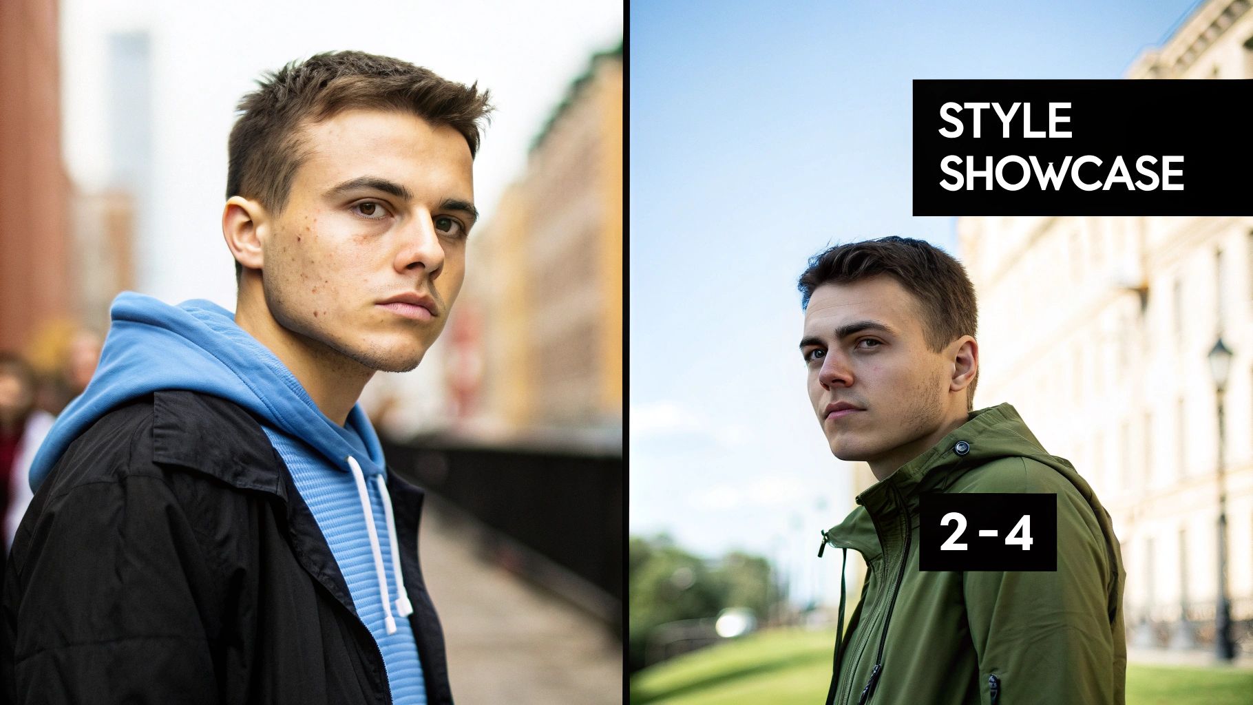
How to Create a Cinematic Colour Grade
Alright, let's get our hands dirty and build one of the most sought-after looks in both photography and film: the cinematic colour grade. You know the one—that iconic teal and orange palette that instantly makes an image feel like a movie scene. It’s popular for a reason; it creates a stunning colour contrast that makes your subject, especially skin tones, really pop.
This isn't just a list of steps. I'm going to walk you through the entire process, explaining not just what to do, but why each tweak is so important for building that final, polished look. We’re going to take a regular photo and give it mood, depth, and a story to tell.
This diagram gives a great overview of a typical editing workflow. Notice how colour grading is the last creative touch you add before exporting.
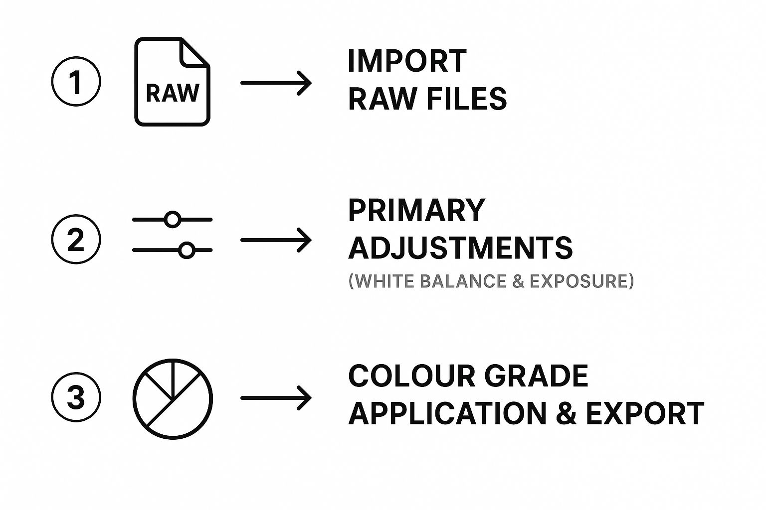
As you can see, all the foundational, technical fixes have to come first. You can’t build a great grade on a shaky foundation, and that’s exactly how we’ll approach this.
Step 1: Start with a Solid Foundation
Before you even think about adding style, your photo needs to be clean and neutral. This is that critical colour correction phase we talked about earlier.
Crack open your RAW image and nail these basic adjustments first:
- White Balance: Make sure your whites are actually white. Get rid of any weird colour casts. The quickest way is to use the eyedropper tool on a neutral grey or white spot in the image.
- Exposure: Get the overall brightness right. You don’t want any crushed, inky blacks or blown-out, detail-less highlights.
Getting these basics locked in is non-negotiable for a professional result. If you skip this, you’ll end up with muddy colours no matter what you do later.
Step 2: Sculpt Contrast with the Tone Curve
This is where we start shaping the mood. For that cinematic look, we're aiming for a contrast that feels organic, almost like it was shot on classic film stock. The secret is a gentle S-curve.
Head over to your Tone Curve panel and add three points to the line: one for shadows (bottom-left), one for midtones (middle), and one for highlights (top-right).
- Gently pull the shadows point down a bit to make the darks richer.
- Now, push the highlights point up just a touch to make the brights pop.
- For that signature "faded" or "matte" look, grab the very bottom-left point on the curve (your absolute black point) and drag it straight up a little.
That S-curve adds some punch, but lifting the black point keeps the shadows from becoming pure black. It’s a simple move that immediately gives your image that soft, cinematic vibe. Staying on top of current visual trends and inspiration is a great way to make sure your grades feel modern and impactful.
Step 3: Master the HSL Panel for Colour Separation
Now for the magic. This is where the teal and orange look really comes to life. Our goal is to push the cool tones (like blues in a sky or in the shadows) toward teal, and the warm tones (like skin or sunset light) toward orange. This creates a powerful complementary colour scheme.
Jump into the HSL (Hue, Saturation, Luminance) panel:
- Hue: Grab the Blue slider and nudge it left, toward cyan/teal. Next, take the Red, Orange, and Yellow sliders and gently shift them toward orange to make those skin tones cohesive and warm. How far you go depends on your specific photo, so trust your eyes.
- Saturation: Pull back the saturation on colours that aren't part of our palette, like greens or magentas. This helps the teal and orange stand out even more.
- Luminance: You can give the Orange and Yellow sliders a little boost in luminance. This brightens up skin tones, making your subject the star of the show.
The HSL panel is your scalpel. Instead of smacking the whole image with one big colour change, you're precisely targeting individual colours to build the palette you want.
Step 4: Fine-Tune with Camera Calibration
The final touch to lock everything in place is the Calibration panel. It’s a seriously powerful tool that adjusts the underlying colour channels of the entire image, tying the whole look together.
In the Calibration panel, we’re going to focus on the Blue Primary slider.
- Shift the Hue slider to the left (heading toward -100). You’ll see it instantly injects a rich teal into the shadows and neutral areas, cementing the cool side of our colour grade.
- You might need to make small adjustments to the Red and Green Primary sliders to get the skin tones just right, but that Blue Primary slider does most of the heavy lifting for this style.
By following these four steps—correction, contrast, HSL, and calibration—you can systematically build a professional and stunning cinematic look. To see how these steps fit into a larger process, check out our guide on creating a repeatable photo editing workflow.
How To Achieve A Light And Airy Pastel Style
Switching gears from the moody intensity of cinematic grades, we now explore the light and airy pastel style. This look has become a go-to for wedding, lifestyle, and portrait photographers who crave a dreamy, soft aesthetic. Think bright, clean exposures paired with whisper-soft contrast and a delicate, desaturated palette.
Over the years, I’ve seen this aesthetic transform simple images into romantic, ethereal scenes. In this guide, you’ll find a straightforward, repeatable recipe to turn any photo into a sunlit memory. Let’s dive in.
Step 1: Lift Exposure And Open Up The Shadows
First, brightness is your foundation. You want your image to feel filled with light without losing essential details in the highlights.
- Exposure: Raise this slider until your photo feels vibrant but not blown out. Watch the histogram closely.
- Shadows: Push shadows up to soften deep tones and erase heavy contrast.
- Highlights: Gently pull highlights down so bright areas like skies or white dresses retain texture.
This step creates a bright, low-contrast base to build your pastel hues on.
Step 2: Soften Blacks With The Tone Curve
Next, the Tone Curve delivers that hazy, matte vibe. Rather than adding punch, we’ll remove harsh blacks for a gentle, faded finish.
- Click the point at the bottom-left of the curve (absolute blacks).
- Slide it straight up until your deep blacks turn to soft grey.
By lifting the black point, you banish stark contrasts and introduce that signature softness.
The light and airy aesthetic is more than simple brightness; it’s an artful grading process that desaturates and reduces contrast, weaving a pastel-infused palette that feels timeless.
Step 3: Tweak HSL Sliders For Pastel Tones
After laying down your base, the HSL panel shapes the actual colours. We’re shifting from bold hues to muted pastels.
- Hue: Nudge Greens toward yellow for a sun-kissed foliage look and shift Blues toward aqua.
- Saturation: Dial down over-vibrant hues—Greens and Blues are often the first to go.
- Luminance: Boost Oranges and Yellows for glowing skin; lift Greens to make leaves feel translucent.
Small, precise tweaks here will define your soft, pastel world.
Step 4: Apply Subtle Split Toning
Finally, add a whisper of unified colour across highlights and shadows using Split Toning or Lightroom’s Colour Grading.
- Highlights: Introduce a hint of warm yellow or orange at low saturation (below 10%) for a gentle glow.
- Shadows: Add a touch of cool teal or blue, also at low saturation, to prevent flat, muddy tones.
Master these four steps—brightening, black point lifting, HSL adjustment, and soft split toning—and you’ll consistently achieve a professional, light-and-airy pastel style.
How AI Is Changing Photo Colour Grading
Manual colour grading has always been an art, but artificial intelligence is injecting a whole lot of new science into the workflow. AI-powered tools are moving way past simple presets and filters. We're now seeing intelligent, context-aware suggestions that save a ton of time and give your images incredible consistency.
Think of it as having a highly skilled assistant right by your side. It handles the tedious, repetitive tasks, freeing you up to focus on what really matters: the final creative decisions.
This isn't just some minor update—it’s a fundamental shift in how photographers are approaching post-production. The market for AI image editing tools is blowing up to meet this demand. In fact, forecasts predict the market will grow by USD 109.8 million by 2029, all driven by our need for faster, smarter editing. You can see more on this explosive growth over at GlobeNewswire.
Intelligent Masking and Subject Detection
One of the most mind-blowing benefits of AI is its knack for making complex selections in seconds. Manually masking a sky, a person, or some tiny object used to be a soul-crushing process of brushing, refining, and zooming in until your eyes hurt.
Now, AI does all the heavy lifting for you.
With just a single click, AI can:
- Isolate Subjects: Instantly create a perfect mask around a person, letting you tweak their brightness or colour without messing up the background.
- Select Skies: Automatically detect and mask the sky. This makes it ridiculously easy to punch up a sunset or add some drama to boring clouds.
- Identify Backgrounds: Separate the foreground from the background, which means you can apply different colour grades to each and create a real sense of depth.
This kind of automated masking lets you apply incredibly targeted adjustments with a speed and precision that just wasn't possible before.
AI-Powered Style Matching and Suggestions
Another game-changer is AI style matching. Let's say you find a photo with a colour grade you absolutely love. Instead of spending hours trying to reverse-engineer that look slider by slider, you can let an AI analyze the reference image and apply a similar grade to your photo.
It’s smart enough to assess the colour palette, contrast, and tones of the original and then cook up a custom grade for your shot. Not only is this a massive time-saver, but it’s also a fantastic starting point for your own creative touch. Some tools even offer AI-driven suggestions, analyzing your specific photo and presenting several pro-level options to choose from. If you're curious about the tech behind this, you should check out our guide on the role of artificial intelligence in photography.
AI isn't here to take over your creative vision. Instead, think of it as a powerful collaborator. It handles the technical grunt work, freeing you up to make higher-level artistic choices and nail that final look.
By taking tasks like masking off your plate and offering intelligent starting points, AI gives photographers the power to get complex, professional results more efficiently than ever. It's a tool that works with the artist's eye, not against it.
Common Colour Grading Mistakes to Avoid
Mastering photo colour grading is a journey, not a destination. Along the way, it’s all too easy to pick up a few bad habits or fall into common traps—even seasoned pros aren't immune. This guide will help you spot and fix the most frequent slip-ups so your final images look polished and intentional, not overcooked.
Recognizing these pitfalls is the first step to really dialing in your technique. From garish, over-the-top colours to losing critical details in the shadows, let's break down what to watch for and how to steer clear for truly professional results.
Mistake 1: Oversaturation
This is probably the most common mistake in the book. It’s so tempting to just crank the Saturation slider to make your colours pop, but it’s a blunt instrument. It globally intensifies every single colour equally, which is a fast track to unnatural skin tones and neon hues that just look cheap and amateurish.
Think of it like turning up the volume on every instrument in an orchestra at once—you don't get music, you get noise.
Instead of hitting that main saturation slider, try these smarter approaches:
- Use the Vibrance Slider: This tool is much more intelligent. It focuses on boosting the more muted colours while protecting tones that are already saturated, especially skin.
- Target Colours with HSL: If just the greens in your landscape feel a bit dull, jump into the HSL (Hue, Saturation, Luminance) panel and boost the saturation of only the green channel.
This targeted method gives you surgical control, leading to a much more balanced and believable final image.
Mistake 2: Unnatural Skin Tones
Nothing screams "bad edit" faster than skin tones that are off. Skin that looks too orange, magenta, or even a sickly green is a dead giveaway that a grade has been pushed too far. The goal is always to make skin look healthy and natural, even within a stylized colour palette.
A great colour grade should feel invisible. If the viewer is thinking about the editing choices you made, you've likely pulled them out of the moment the photo was meant to capture.
The HSL panel is your best friend here. Isolate the orange and red channels, since they have the biggest impact on most skin tones. From there, you can make tiny adjustments to their hue, saturation, and luminance to bring them back to a natural place without having to scrap your entire grade.
Mistake 3: Crushed Blacks and Clipped Highlights
This one's a classic. It’s when you lose all the detail in the darkest and brightest parts of your photo. Crushed blacks are when your shadows become a solid, detail-free black blob. Clipped highlights are the opposite—bright areas turn into a pure, textureless patch of white.
This usually happens when you get a little too aggressive with an S-curve on the Tone Curve. To stop this from happening, always keep one eye on your histogram. If you see the graph slamming up against the far left (the blacks) or the far right (the whites), you're losing information.
The fix is simple: just slightly lift the black point or pull down the white point on your Tone Curve. This will bring that valuable detail right back into the frame.
Frequently Asked Questions About Photo Colour Grading
Jumping into the world of colour grading always brings up a few questions. To help you get your footing and build confidence in your workflow, I've put together answers to some of the most common things photographers wonder about as they dive in.
Think of this as your quick-reference guide. Let's clear up any confusion and get you grading.
What Is the Difference Between a LUT and a Preset?
This one trips up a lot of people. The easiest way to think about it is this: a preset saves all your specific slider adjustments inside one program, like Lightroom. It’s a recipe that you can apply and then tweak every single ingredient.
A LUT (Look-Up Table), on the other hand, is more like a universal translator for colour. It’s a mathematical file that maps one set of colours to another, which is why you can use the same LUT across different photo and video editing software.
To put it simply, a preset is like a detailed recipe you can adjust as you cook. A LUT is more like a finished sauce you pour over the top—less flexible, but consistent everywhere.
Should I Colour Grade in Lightroom or Photoshop?
For most photographers, Lightroom is the place to be for colour grading. Its entire interface is built from the ground up for managing and grading huge batches of RAW photos efficiently. Honestly, you can probably do about 90% of all your colour work without ever leaving it.
So, when should you switch over to Photoshop? Think of Photoshop as your specialist surgeon. You head there when the job calls for complex, layer-based adjustments, heavy-duty retouching, or combining multiple images. The best workflow often starts with the main grade in Lightroom and then moves to Photoshop for those final, precise touches.
How Do I Develop a Unique Colour Grading Style?
Finding your own signature style is a journey, not a destination. It really starts with paying close attention to the work of photographers you love. Don't just look at their photos; analyze them. How do they treat their shadows? What do they do with highlights? Which specific colours pop, and which are muted?
Next comes the fun part: experiment like crazy. Get into your editing software and push the Tone Curve and HSL panels around. Don't be afraid to crank a slider to its limit just to see what happens. When you stumble upon a look you really like, save it as a preset. Over time, as you keep analyzing, experimenting, and saving, you'll start to see patterns. That's your style, emerging all on its own.
Ready to push your creative boundaries even further? AI Photo HQ offers powerful tools to generate stunning, unique visuals in seconds, giving you a new playground for colour and style. Explore endless possibilities and supercharge your creative process at https://aiphotohq.com.


